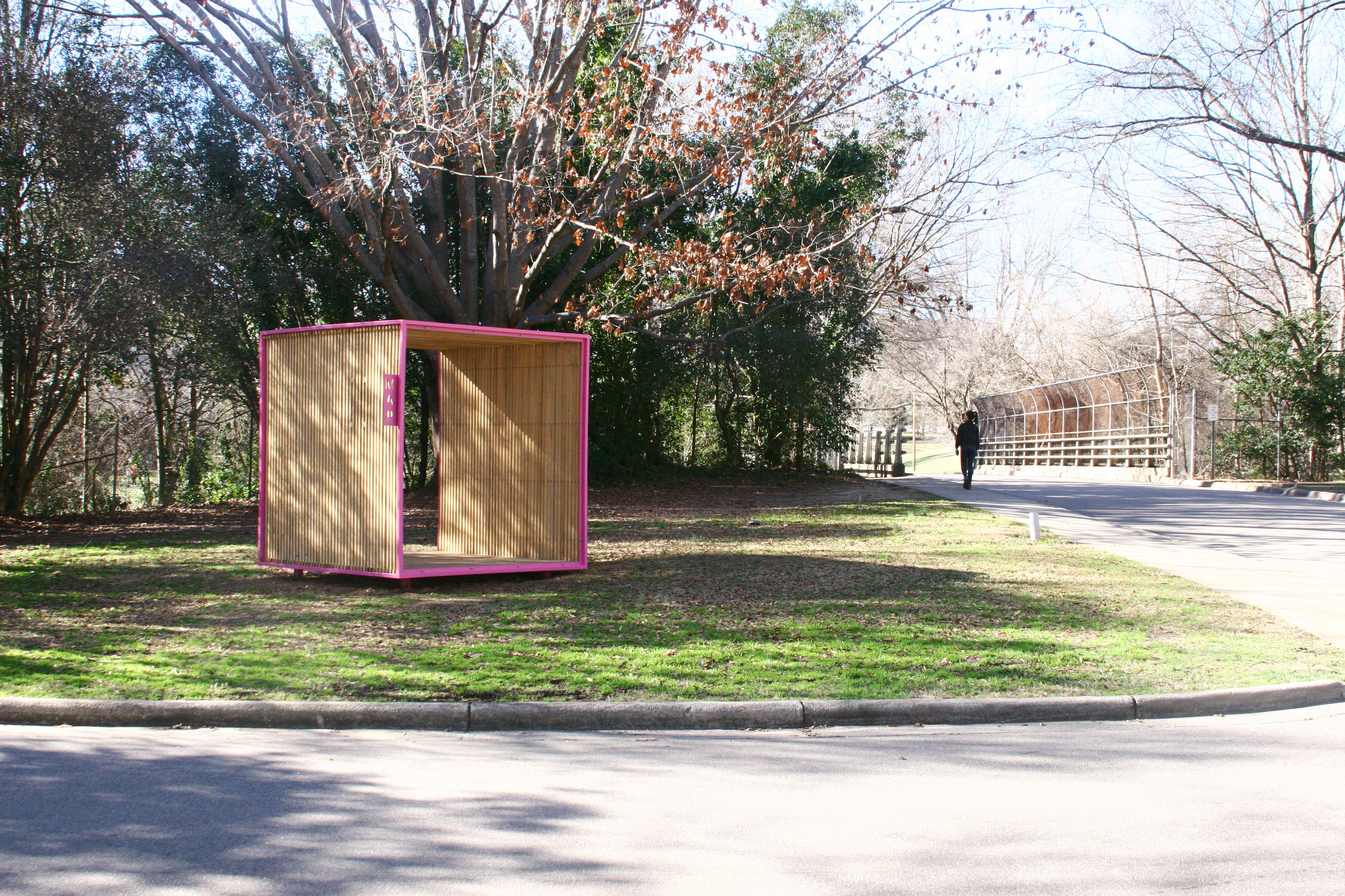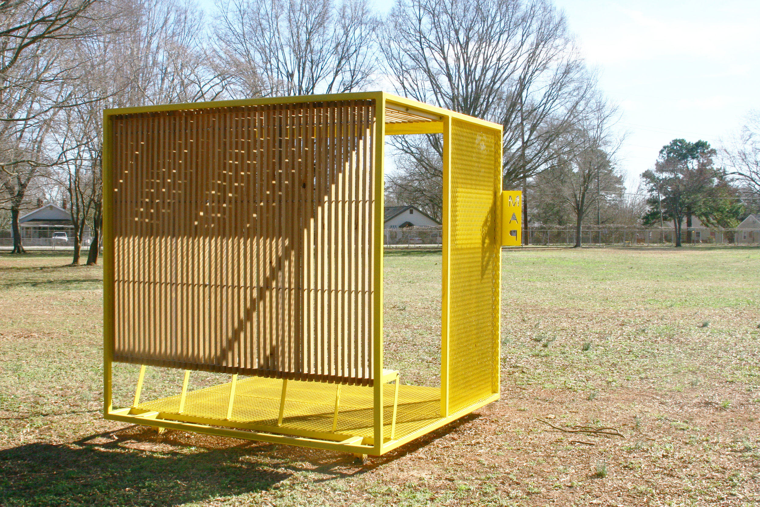
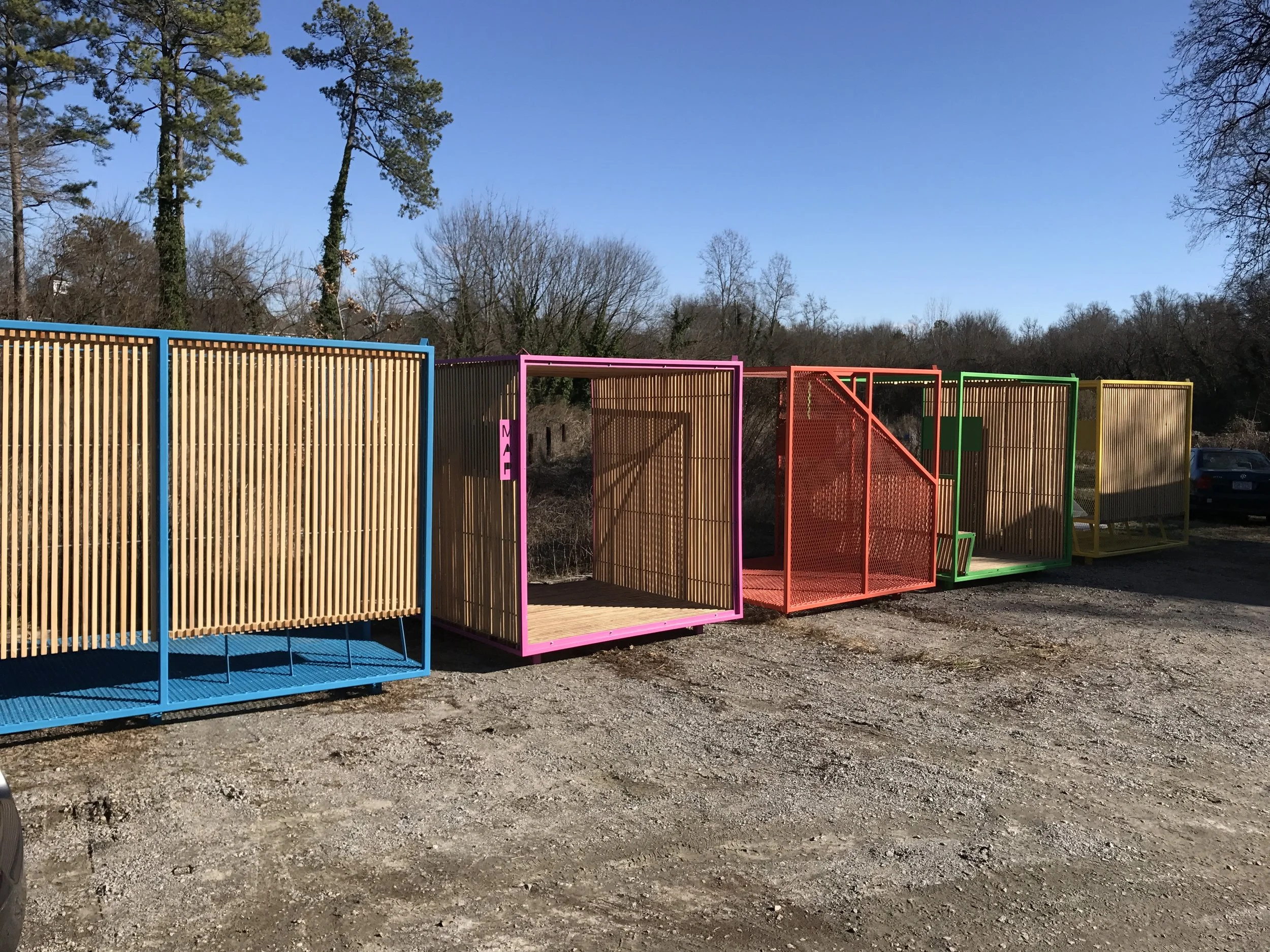
Wayfinding Kiosks
The design impetus behind the kiosks at Dix Park was to enhance the visitor experience. The kiosks are designed to contrast with the softer, natural environment by visually indicating a change in program. These brightly colored steel cubes clearly express: “Something to explore!” To keep the geometric form undisturbed, the connections between wooden slats and steel frame were given priority from the beginning. The vivid kiosk colors were influenced by Dix Park’s new graphic design package thereby integrating them into the revitalization plan. Each kiosk displays an acrylic map custom designed to be read using a monochrome, steel backplate and includes icons pointing out special assets for each kiosk location.
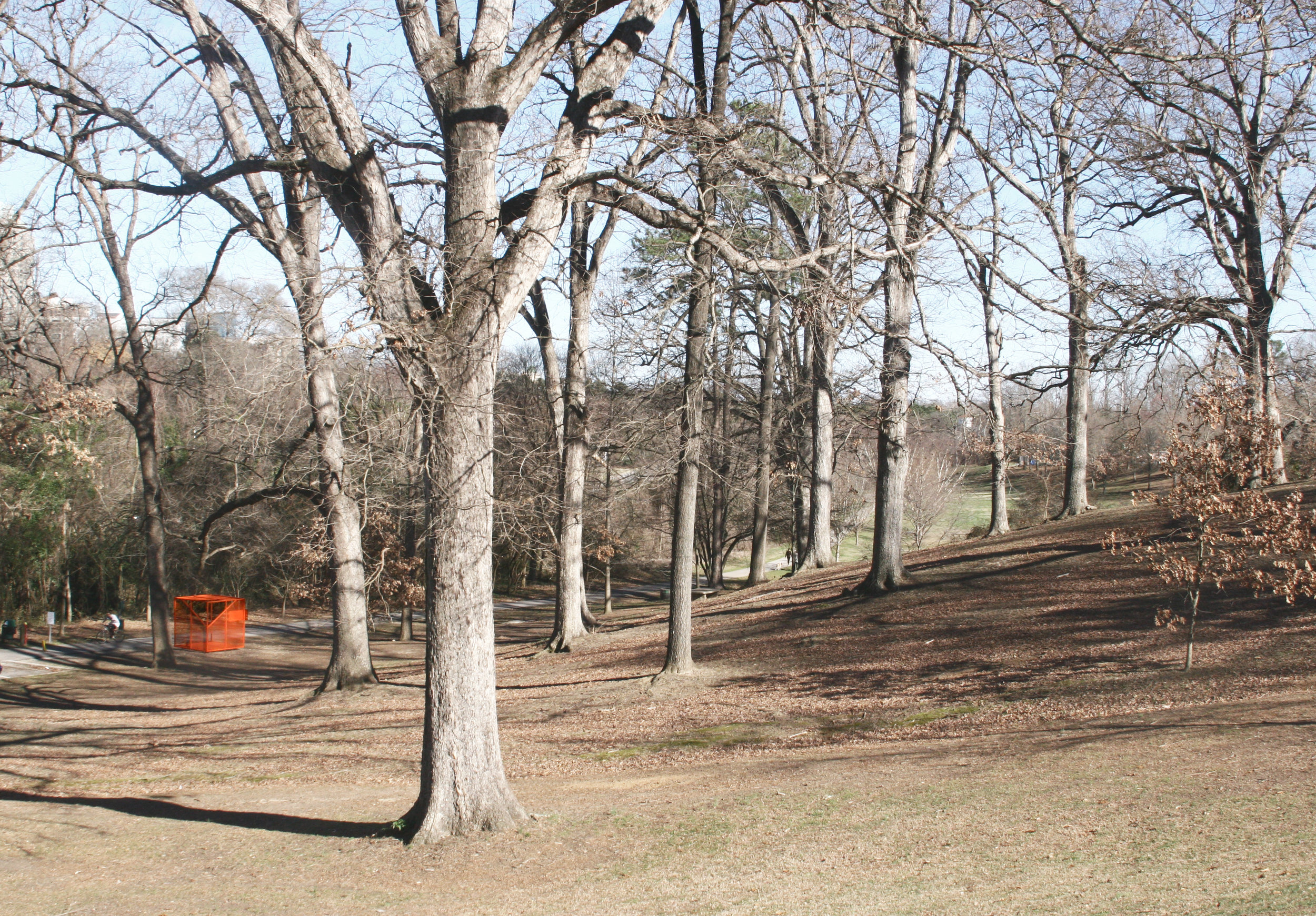
The center 40% of Dix Park’s core is currently still utilized by the State of North Carolina as DHHS headquarters. This proves challenging for the Dix Park Conservancy and the City of Raleigh, who are just beginning a multi-year public outreach mission to encourage visitors to the park. The park’s ultimate redevelopment will not break ground for another 5-6 years, so the kiosks were conceived as a solution for visitors to help navigate the park. Strategically placed in each large public space of the sprawling 308 acre park, the kiosks provide navigational information as well as refuge as visitors navigate through and around the complicated leaseback zone.
Beyond helping visitors orient themselves at Dix Park, the kiosks were designed to be playful, energetic follies on an already impeccable landscape. They inherently delight and playfully express the mission of Dorothea Dix Park. They encourage visitors to explore the park as it is, and imagine the possibilities for what it can become!